Another Experiment: Painting Shells

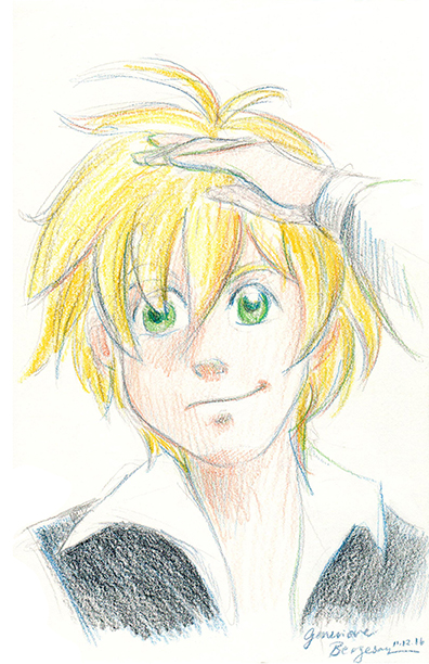
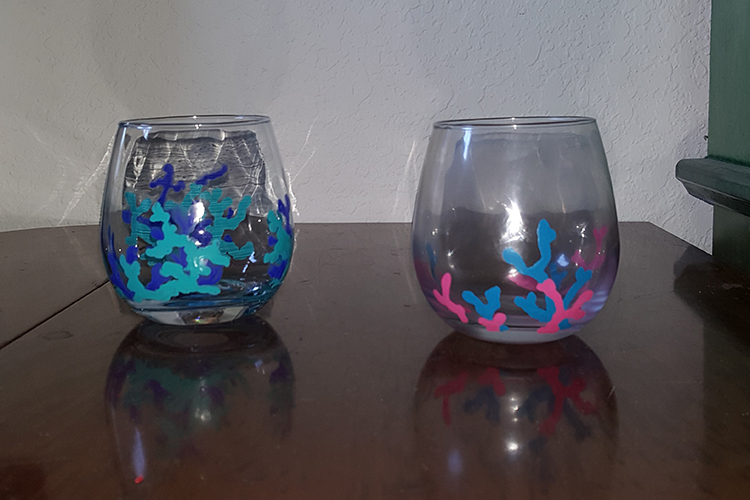
As many of you know, this year I’ve had the opportunity to try my hand at new creative activities: making haiga, painting glassware, and restoring (or touching up, as it were) old paintings, to name a few. Now I’ve another one to add to the list: painting shells!

I took a similar approach to painting shells as I did to painting glass, which can be summed up in three steps:

  1. Clean the surface
  2. Paint (I used acrylics)
  3. Apply a finish

All the shells pictured below were either off-white or yellowish before they met paintbrushes. More often than not, I had to put a little extra paint on the brush to reach into all the ridges and holes. Adding a couple drops of water to the paint already on the brush worked, too–the principle being to make the paint less viscous so it flows more easily into the gaps. The color, of course, was a bit less opaque. At first I thought solid paint would look the best–that is, applying a thick enough layer so that any colors and patterns naturally on the surface of the shell could not be seen at all. But also I found that a slight transparency looked pretty cool, better, in fact on some of the shells. Now I think it just depends on the shell (or whatever I’m painting on the shell).

pink-shell-12-5-16   

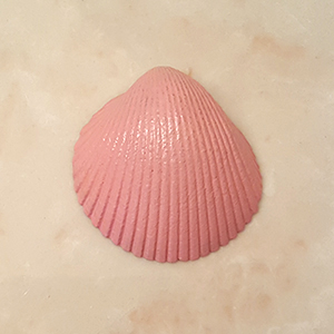
A simple pink scallop.
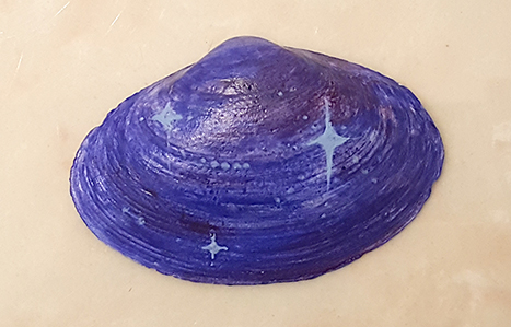
 starshell1

A stellar shell.

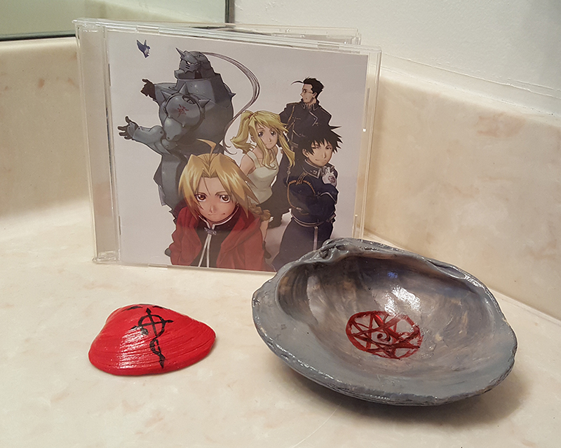
And then some fun that requires an explanation. There’s a manga & anime series called Fullmetal Alchemist that was released (in America) when I was in high school, and some friends and I got pretty into it. It’s still an immensely popular series. FMA follows two alchemist brothers, Edward and Alphonse Elric. Ed, the main character, wears a red jacket with a black symbol on the back. Al, his younger brother, is, frankly, a giant suit of arm wearing a pink half-length apron. (His body vanished in a disastrous experiment; Ed tethered Al’s soul to the armor so he wouldn’t disappear entirely. My experiment in painting shells was more successful and far less hazardous.) They spend most of the story searching for a way to reconstitute Al’s body, getting tangled in military/international affairs, and uncovering deep, dark secrets and unethical science experiments.

I now present to you Fullmetal Shellchemist.


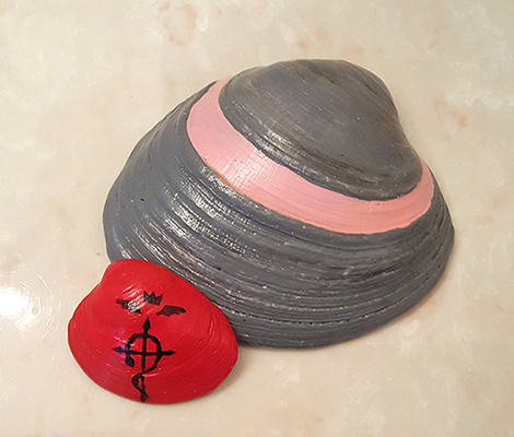
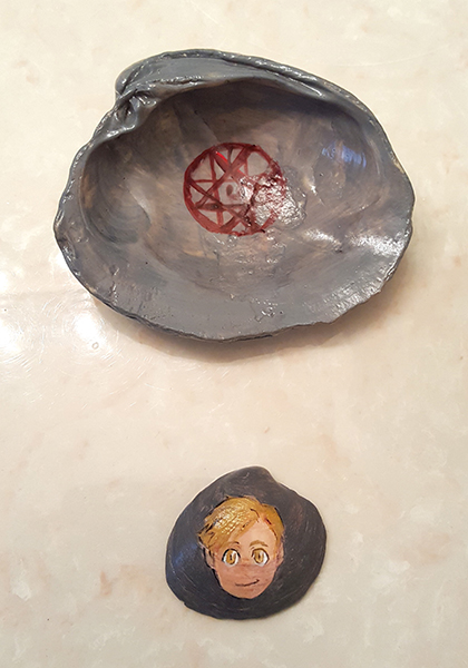
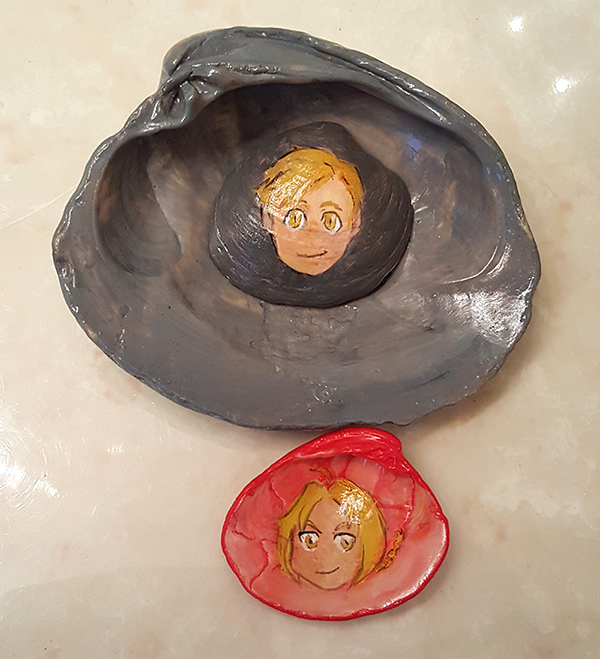
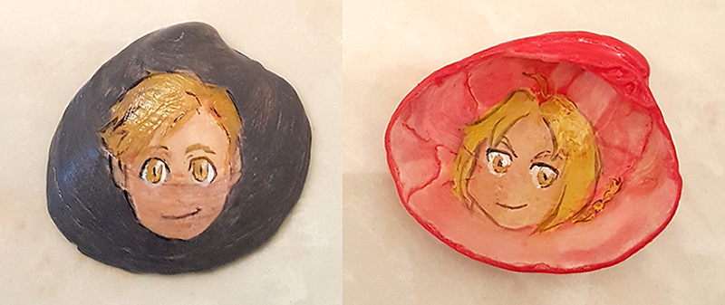
The red shell is the Ed shell. The exterior mimics his red jacket; flip it over to see his face. Al gets 2 shells: the big clam representing the suit of armor and a smaller one with his portrait. The pink stripe on the exterior represents the apron. Flip over the armor shell to see the tethering seal and the portrait shell underneath. Click any thumbnail to enlarge. Maybe I’ll paint some shells blue for the military characters. (They wear blue uniforms.)

The results of this experiment are conclusive: I will paint shells again.

Convention Pictures (Nov. 2016)

As promised, here is a selection of drawings and photographs from the anime convention. First, a peek behind the scenes at my booth. You can see how I secretly stored my drawing supplies to keep the display tidy. I also brought a clipboard so I could draw on my lap. It proved useful.

aniwai-t04

Now for some drawings!

Himura Kenshin Sailor sketch Sailor

Left to right: Himura Kenshin (from Rurouni Kenshin), sailor sketch, sailor in color. I drew the sailor as a thank-you to another artist at the convention for a drawing he gave me. I changed the expression for the final drawing–determined and ready for adventure!

Afton Elethea Meliodas

Left to right: Afton (original character) Elethea (original character), Meliodas (from Nanatsu no Taizai).

This is my favorite photograph from the convention. The drawing is a Pokémon spoof on Mozilla Firefox. The plush toy and the Pokémon in the drawing are both Flareon, a fire-dog creature. I talked with the plushie owner a lot over the weekend. (She stopped by my booth every day). On the last day, she had the little Flareon with her. Picture-perfect.

Convention Reflections: November 2016

About a week and a half ago, I attended what is both my 2nd and 3rd anime convention artist’s alley. 2nd because it is the second different convention I’ve attended (the other one being Kawa Kon) and 3rd because it is my third time hosting a booth.

No matter what number, I get ideas each time: ideas for art projects, art supplies to try, web & print resources, display—all sorts of things. I also learned how a button press works.

To spruce up my booth, some new items were added. I used a scarf and a table cloth on top of the white already provided by the hotel. (Both textiles are from India—gifts college friends brought back from an abroad program—and I am glad for these beautiful items to come out of storage.) The new chests double as display bins by day and storage bins by night.

aniwai-t01 aniwai-t03

The table set-up was a bit different than I expected. Instead of being lined up right next to each other, the tables were spaced a few feet apart, leaving the sides open for display. I put Pandagram stickers and sticky tack to (hopefully) good use. I’ll have to think more about how to utilize the short sides of the booth in the future.

aniwai-t02

This convention seemed larger than Kawa Kon, but still comparable. Business was slower than expected, but I am grateful the numbers came out okay in the end. I am also grateful that I got to know some new people over the course of the weekend. Talking with other artists (musicians, too!) and convention guests is fun, especially (as I have said before) encouraging other artists and writers.

To add to the fun, I drew a lot during the event, too. Between commissions and slow periods, there were many opportunities to draw. Seeing the cosplay is also great fun. Costumes are a wonderful outlet for creativity. More on these creative endeavors later, I think. I’ll post pictures (definitely drawings, possibly photos) some time after the holiday. 

Until next time, smooth sailing, and blessed Thanksgiving!

First Haiga

Haiga? What’s that?

If you know what haiku is, you’re halfway there! Haiga is the combination of one haiku and an image, traditionally an ink painting, though other media (including photography) are popular and acceptable today. The two elements of haiga are complementary; one needs the other to get the full effect. The image is not illustrative, nor is the haiku a caption. For instance, if a haiku or senryu is about children playing with autumn leaves, a good haiga will not  depict those children playing in a pile of leaves. It might depict leaves, children, an autumn bird, or trees, but not the exact subject of the haiku. However, overlap is not forbidden. A haiku about a crane calling across the marsh may be paired with a painting of a crane, for instance. Again, the two items should be complementary, but not redundant.

I submitted these to a haiga contest in mid-to-late September. Judging was in late October, so I decided to wait to post these after the contest finished. The top haiga is an example of what I called overlapping just now.

haiga_blackberries-150dpi

This was painted in watercolor. Though Japanese ink paintings are primarily grayscale, I love working with color, so I chose a dark blue-violet pigment that could echo the light and dark values of traditional works. I also kept the painting fairly simple—closer to a silhouette than a rendering—to echo the simplicity of the senryu.

haiga_bubbles-150dpi

This one is also a monochromatic watercolor haiga. Although this senryu has nothing to do with blowing bubbles, their union instantly appealed to me and demanded to be expressed. Both dreams and bubbles have beautiful, ephemeral qualities. Moreover, in earlier versions of the senryu, I had specified “summer dreams”; though “summer” no longer appears, I still wished to convey the bliss that I associated with that in this haiga. Both the image of blowing bubbles and the use of a bright blue pigment satisfied that wish. (This one is the first haiga I created.)

If you’d like a refresher on haiku, these two posts from 2014 have short sections about the elements of haiku. In the 2nd one, look for the third header (“Haiku-coo for Cocoa Puffs”): 4th (update) of July and August Advancements.

On another note, last weekend, I attended another artist alley at an anime convention. Watch your inbox for a post!

More Glass Painting

Last week I had the opportunity to do more glass painting. My mother has several short glasses that had nautical patterns printed on them, sort of like thin, heat-resistant stickers, and they have been wearing away over time. Once they wear almost completely off, I scrape of the remainder and repaint them. Design of choice? Coral. Simple, colorful, and hard to mess up. I also painted two more china plates to hide the chipping.

coral-glasses-1-2

If you missed my last post about the glass painting process/my first try, you can read that here.

Lately I’ve been doing a lot of little painting projects, so November should bring a few more artsy updates than usual. ‘Til next time.