Pirates on the Brandywine I

Today we’ll begin a two-part series that explores pirates and other American illustrations from museums in the Brandywine River Valley. There is, of course, much more at each museum than what I will cover—a luminous George Inness, for example (Early Autumn, Montclair)—but if we are to be honest, my primary purpose for visiting these museums was to see the pirate paintings.

“Arr yawl” ready to “sea” some, too? (Forgive me for resurrecting that salty pun from the prior post.) Let’s jump in.

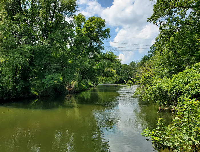
Voici le Brandywine.

Now jump! (Just kidding.)

All photographs in this post were taken by me.

Illustrations by Howard Pyle

First I visited the Delaware Art Museum. Originally the Wilmington Society of the Fine Arts, the museum was created to preserve the works and legacy of Howard Pyle, a Wilmington native and leading American illustrator. Over time, the collection expanded to include much art connected to the area, Pre-Raphaelite art, and American illustration.

Pyle taught locally and eventually opened his own art school. He instructed a generation of American artists and illustrators, known as the Brandywine School, among them Frank Schoonover and N. C. Wyeth. About half of his students were women. Pyle also wrote and produced books, such as The Merry Adventures of Robin Hood.

His pirate illustrations, among others, garnered significant attention, and it is to these that society’s romanticized vision of pirates is largely indebted. One could rather safely say the look of every popular buccaneer from Captain Blood to Captain Jack was influenced, directly or indirectly, by Pyle’s paintings. Pyle combined historical clothing articles, props, and other objects to create exotic but realistic figures such as this fellow.

The Buccaneer Was a Picturesque Fellow from Pyle’s “The Fate of a Treasure Town”  

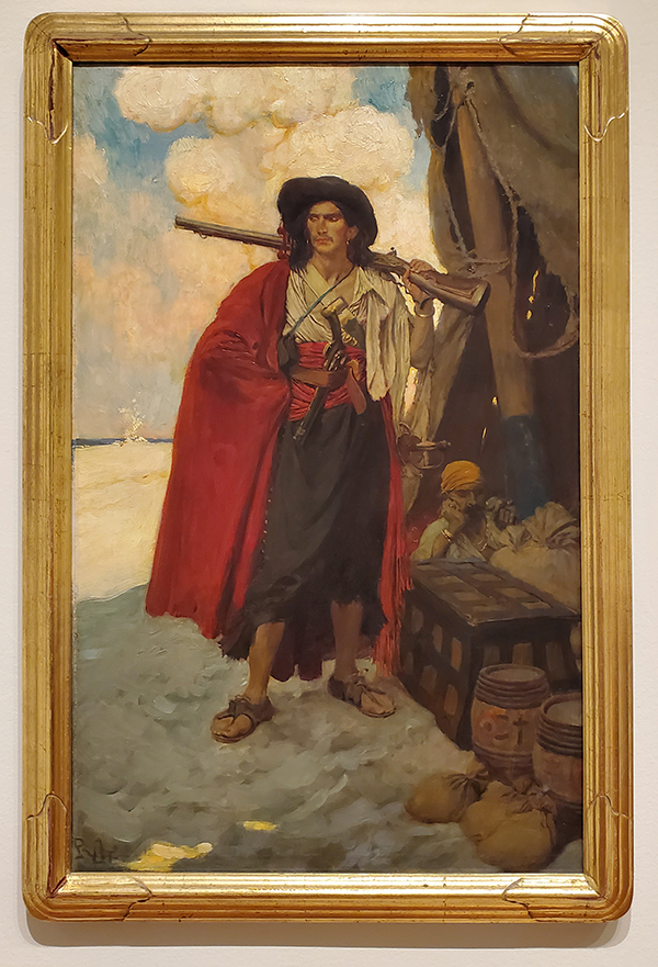
I have seen this painting many times, but not until recently did it occur to me that this painting could also have influenced the design (again, directly or indirectly) of Red-haired Shanks from the long-running pirate manga One Piece. 26 years and still going!(!!) I can hardly imagine plotting & drawing the same story for that long.

Images compiled from One Piece, vol. 1, created by Eiichirō Oda.

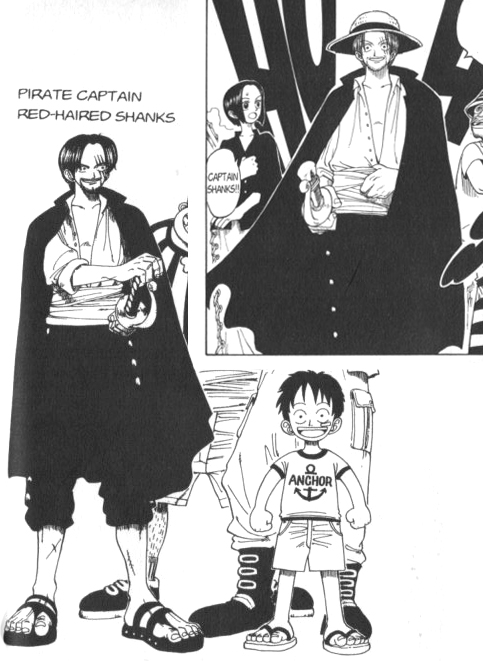
Obviously this is not colorized, but his sash is red like the picturesque fellow’s.

Here are some lessons from Pyle:

On selecting what of the story to illustrate: “In painting we can only picture the supreme moment, leaving to the imagination what precedes and follows.”

He also had much to say on creating effective & engaging compositions. Space, color, and what I would call dynamic lines all can draw attention to key elements. Of space in particular, he advised not to crowd an image: “They will never shoot you for what you leave out of a picture.”

I think An Attack on a Galleon is a good example of some of these principles.

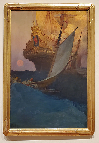
There are details, but nothing superfluous. Note the layered placement of the ships on two different waves/two different parts of the painting ground/picture plane and their size difference. These heighten the drama. I enjoy the rich colors.

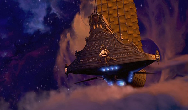
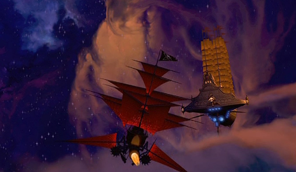
Another case of influence: compare Galleon to the opening of Disney’s Treasure Planet.

With painting as with writing, revision is useful. Both these paintings are titled Marooned. Both are excellent (despite the glare on the book page on the first), but the second one is more striking and conveys the concept even better than the first.

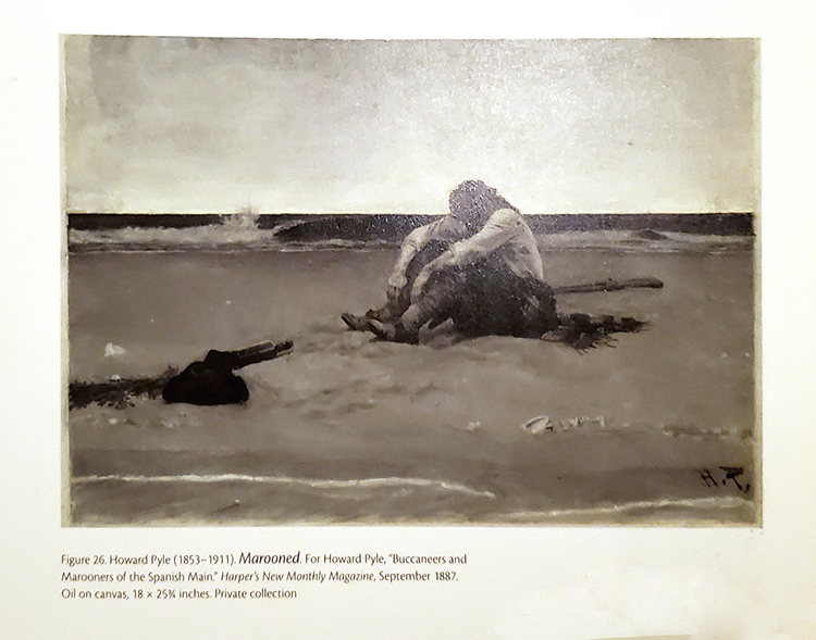
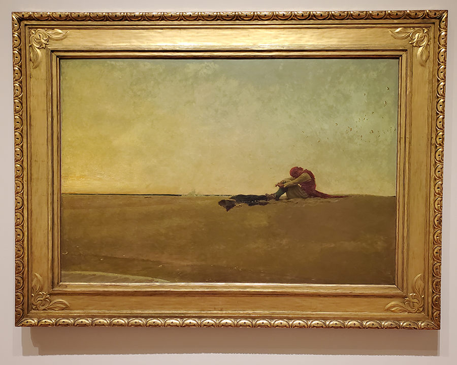
The first painting seems more focused on the buccaneer, and the second on the concept overall. By changing the perspective, Pyle heightens the sense of isolation and barrenness. He reduces the horizon line to just a spit of wave and the water line to a little sea foam receding in the corner. There’s no offing to scan for ships or look out upon with a speck of hope. Everything is suspended at that moment, like there is nothing beyond that stretch of sand and the desolation of isolation.
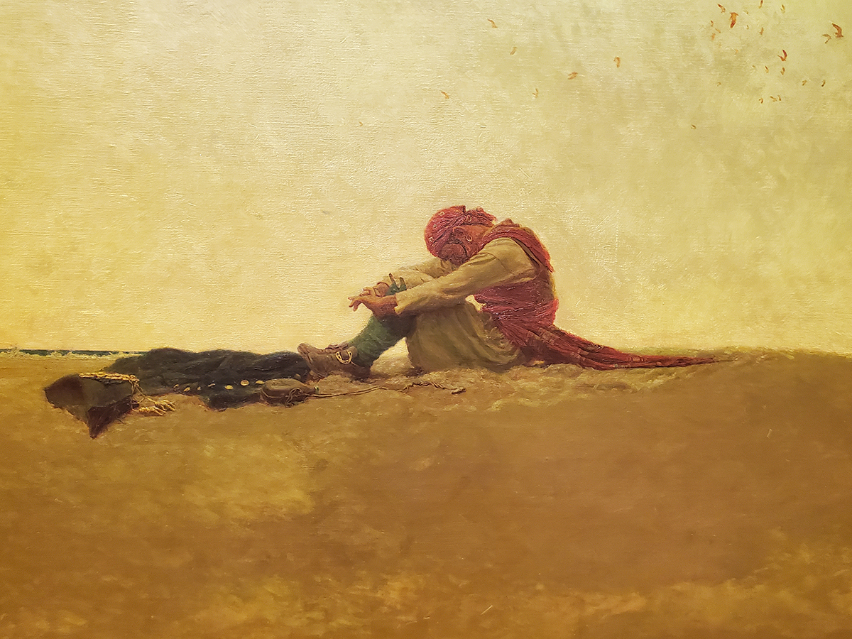
Here’s a close-up.

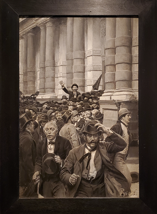
Pyle spoke against crowding an image, but that does not mean he did not paint crowds. Here, a different kind of piracy may well have been afoot: The Rush from the New York Stock Exchange on September 18, 1873, from “A History of the Last Quarter Century.”  

Other fun from the visit

Cartoonist Al Capp’s (Li’l Abner) description of modern art: “A product of the untalented, sold by the unprincipled to the utterly bewildered.” Ha. There are exceptions, but that covers a lot!

In the Divine Comedy, Dante and Virgil’s journey begins with a descent into hell.

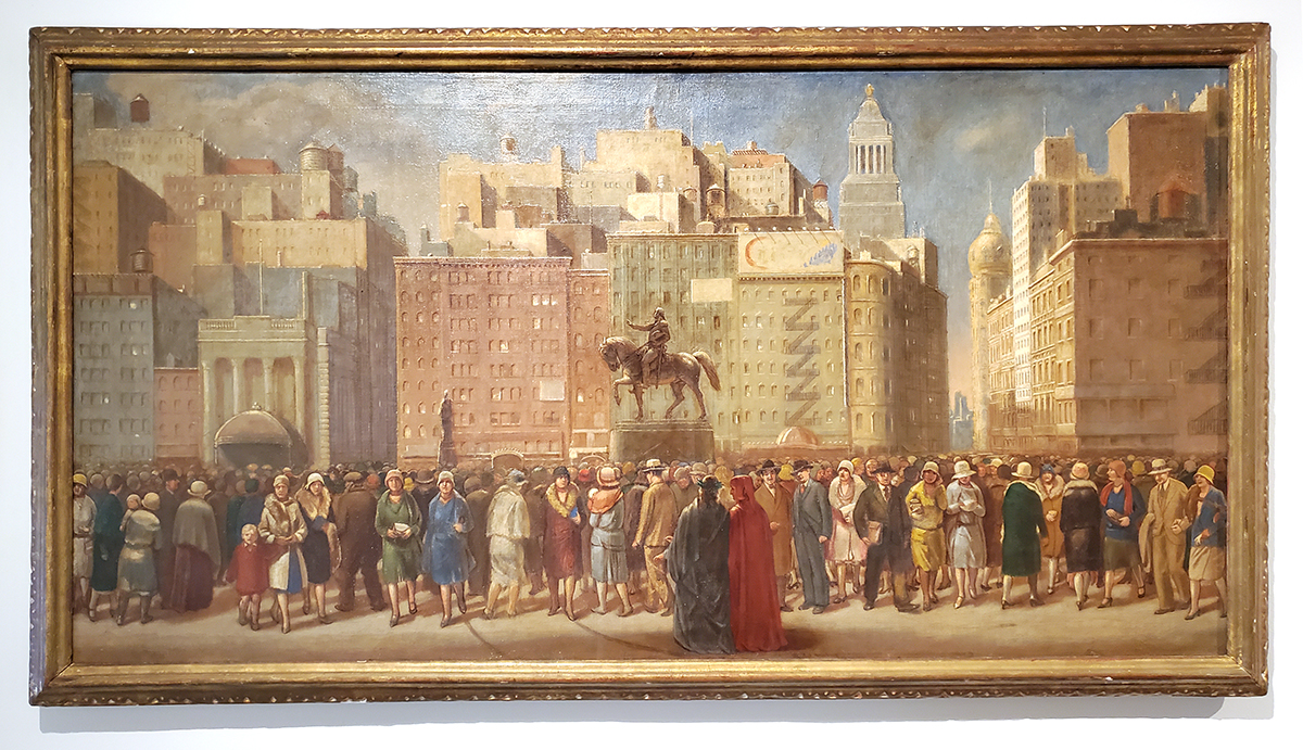
Or NYC. This is Dante & Virgil in Union Square by Isabel Bishop.  

Outfitting the C. [Charles] W. Morgan by Clifford Warren Ashley for his book Yankee Whaler.

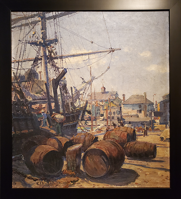
This was a pleasure to see. I spent a significant part of childhood in Mystic, Connecticut, and I have walked the decks of the Morgan many times at Mystic Seaport. 

So I don’t go overboard with sharing more artwork, that’s all for today. Part two will cover my trip to the Brandywine River Museum of Art in Chadds Ford, Pennsylvania.

Art Selected for 2024 Calendar

One of my paintings has been selected for inclusion in Principia’s 2024 calendar and annual series of alumni art cards. The calendar’s theme is light. In January, an online exhibit of all the art will open, and I will share the web link when it is ready.

For 2021, my workplace created an inspirational calendar that also had light as the theme. Since the audiences overlap and I had two pieces in the earlier calendar, I had to think a little about what to submit this time to avoid duplication.

The selected art is actually not a final piece, so I was mildly surprised it made the cut. It is an oil sketch to explore ideas and techniques, a stepping stone to an eventual polished work. Here is Color Study, Lanterns, Narita. (An unpretentious, factual title, to be sure. Such it is with studies.)

It draws from my trip to Japan in 2019. The last night, one of my travelling companions and I took the train from Akihabara to Narita. The evening was quiet and rainy. On the walk to the hotel, we passed some little shops and restaurants, and one in particular caught my eye. Lit colored lanterns and fish nets hung over the entrance. There was something attractively atmospheric, or atmospherically attractive, about it. My hope is that when I work on the polished version, I can recreate some of the mood.

That’s all for today’s news. If you missed my last post, please have a look–my newest book, A Psalm for When I Wander is available! (The first link is to the announcement & the second to the book page.)

Next time, I have what I hope will be a fun treat, no tricks. (It was not intended for Halloween but will complement it given the subject matter.) I will share highlights from recent visits to Delaware Valley museums noted for their collections of American art and illustration, especially Howard Pyle and N.C. Wyeth, both of whom gained some renown for painting boatloads of buccaneers. “Yawl sea” where this is headed? It will be all hands on deck for the seaworthy special entry Pirates on the Brandywine!

New Book: A Psalm for When I Wander

I am delighted to announce my newest book! A Psalm for When I Wander is a poem about God’s guidance and the third book I have written, illustrated, and published.

It is fair to say this book was 9 years in the making. (Representative of the 9 spheres of heaven?) The illustrations were painted in 2014 for a different project that did not come to fruition. Because they had been made to accompany a specific manuscript (not mine), I considered well what to do for a new text that could stand with the illustrations as a complete, independent work. It became clear that the text should not be a narrative depicted or explained by the art, not so prosaic as “One sunny day, the little white goat wandered away.” Rather, the text and the art should complement each other.

Complements exist in other literary forms. I thought specifically of haiga, a Japanese form that unites poetry, often haiku, with art that often does not literally depict the scene or event in the poem. (In fact, it’s better if it doesn’t.) Traditionally, the poems were paired with simple ink paintings. More types of art are paired today.

Given the illustrations’ pastoral qualities, the only thing to do was to write a poem and prayer about God as shepherd. It took shape over the course of a few months and was inspired by a longer medieval poem. So as not to spoil the delight for those who enjoy discovering on their own, that work shall here remain unnamed.

Aside from a few spots that I edited slightly, the artwork remains unchanged from 2014. To see some of the illustration process, have a look at these past posts (which cover other projects, too):

A Psalm for When I Wander is $10 plus applicable postage.

Other books available:

Please email me if you would like a copy of Psalm or any of the other books. Blessings to all.

Summer 2023 Update

Back in March, I mentioned 3 projects, one short-term (covered in that post), one medium-term, and one long-term project. Here’s the update on the medium-term one, a new book. I wrote (and edited recursively) a poem to accompany the existing art and made a few adjustments to some of the illustrations–all of which always takes more time than imagined. Finally, after a pause and reviewing with a fresh perspective, I am in the process of finding a company to have it printed. There will be a grand unveiling post when it is ready.

I am also sporadically working to finalize a Pandagram design for Pangrams, a panda playing tangrams. When that is settled, I will only be two captions away from producing a new, international-themed Pandagrams card pack. (Japanda and Pangrams are the two still in need of satisfying sayings.)

That’s all, folks. Happy August.

Princeton Art Bazaar 2023 Recap

Hello, world. This is Ella (Genevieve’s cat). Genevieve was so busy preparing for and tidying up after the art fair that I thought I’d help by writing about it for her.

It was more than a year since her last fair, so she decided to test everything again. One day all the furniture began to move, and my whole upstairs changed.

Where are my chairs? What’s this net for? Yummy fishies?

Since my chairs are gone, I’ll lie on this. (Art portfolio.)

Oh, she hangs pictures on the fishnet. She was very happy to discover she can fold up the tent and store it in its bag with the net still attached. She can save set-up time in the future!

Yay, I found some of my chairs. One side is just as good as the other.

Is this table sturdy enough? I’ll test it.

Seems okay. I’ll check the other side.

It’s good! I apply the stretchy seal of approval.

Genevieve kept putting all this stuff on the floor & moving it around. I guess to figure out how it should look.

After coming up with the setup, she put the tables away, but she still wasn’t done. She had to figure out spring cleaning clearance pricing and groupings. We looked at lots of pictures together.

The beach? I think you’ll sell that one. (She did.)

The shoe? Maybe you shouldn’t bring that. (She didn’t.)

An open bin! Is it big enough? Did you pack everything? Can I fit?

She did not let me go outside while she packed the car, so she’ll take over writing the post now.

Thank you, Ella. As you can see, art fairs always take a lot of time to prepare, but gratefully everything carried off without a hitch. What’s more, I have settled on a booth layout that I like and will keep, so I don’t have to repeat the furniture and tent escapades.

The bazaar went very well. The weather was beautiful (especially after a week of rain), there was a good turn-out, and I am satisfied on the sales front. I’m pleased to have sold 3 somewhat larger paintings and several smaller items (and to have a little bit more storage space). More important than the sales, though, are the good conversations I had with people who perused my booth, even if they didn’t buy anything. It is interesting and fulfilling to hear what people find meaningful and special about the artwork.